
The Challenge
Mergers can pose a number of challenges. To achieve a smooth transition, the new identity must be an equal reflection of both parties to avoid resistance. Each of the previous brands had a loyal following so it was important that those existing customers and partners felt like they would continue to get the same care and experience under this new brand umbrella. Creating a fresh look while embracing the experience of both previous organizations posed a unique challenge. Additionally, other strong competitors in the space put a similar emphasis on service and relationships that the COR team does, so we had to bring out another differentiator to stand out from the crowd.
Our Approach
Knowing the potential merger challenge around maintaining trust with employees, customers, and partners, as well as the general industry challenge around differentiating in a competitive space, we set about creating a brand identity and launch strategy that would emphasize company culture, trust, and interconnectedness. We had interviews with stakeholders, external partners, and staff to make sure all voices were heard and leveraged those voices to shape the brand. One of the themes that came through during the interview process was that people felt tremendous trust toward the female leadership driving the organization. We leaned into this trust and the ways that people described these leaders when approaching messaging.

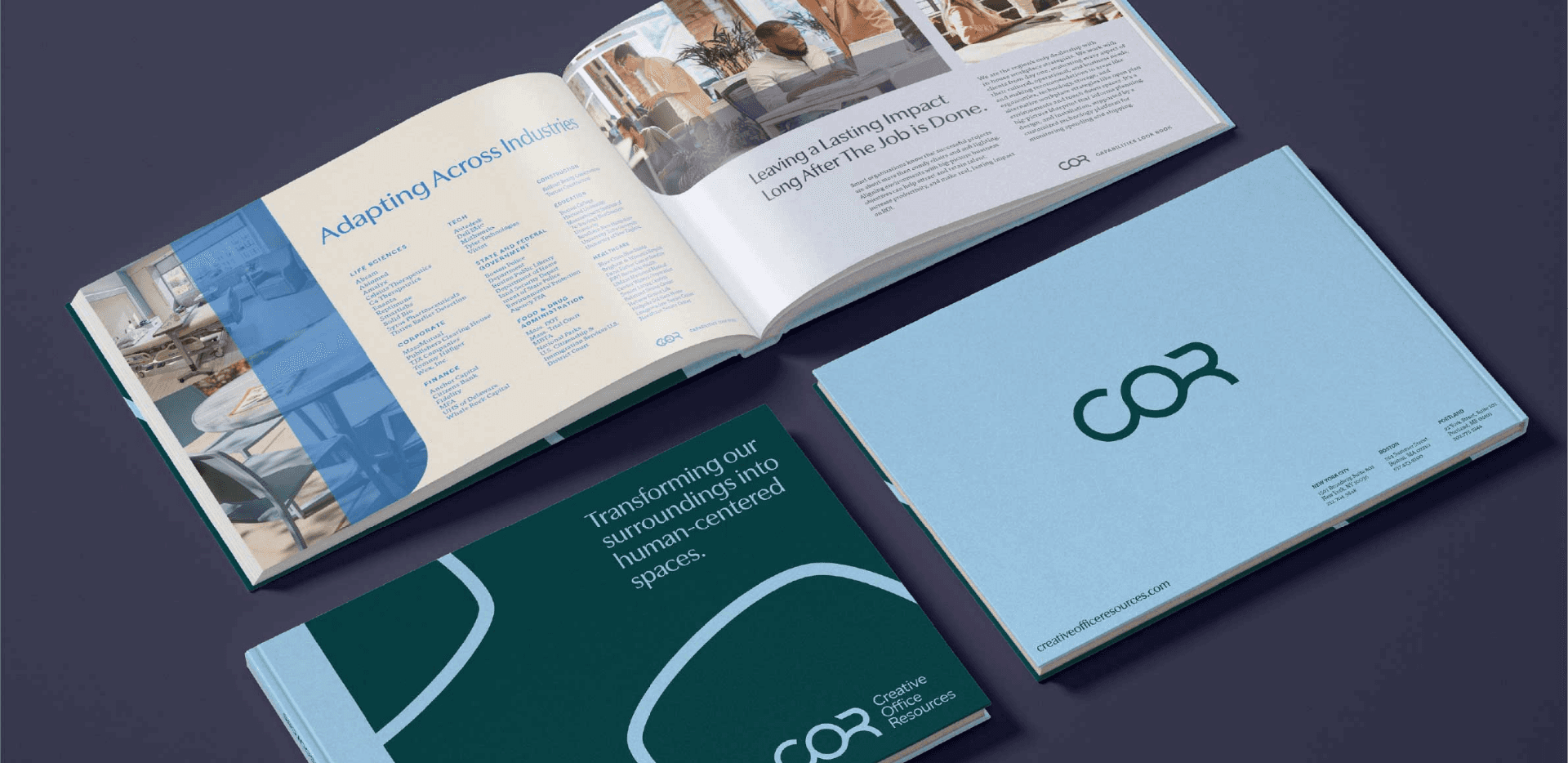
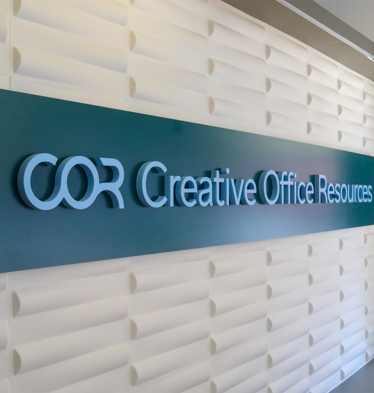
The Logomark
The logo mark is derived from the merger. Taking Office resources and Creative Office pavilion and weaving them together. The O for Office serves as a common connection point between the two businesses. We wanted to create something that felt like a positive representation of the merger and didn’t leave anyone out.


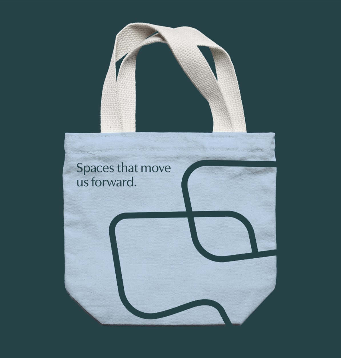
Creating Points of Interest
Line work was inspired by forms within the furniture, paying tribute to their design process in a compelling way. These elements are also used to create a focal point when cropping imagery, making an otherwise static image feel dynamic and interesting. That variety of color and forms speaks to COR’s wide range of services and breadth of knowledge in the industry.


Food & Beverage - Consumer Goods - E-Commerce
Next Project:
Foraged Market ›

" height="282.00000427246096px" id="auQ3nDAie" width="1120.0000146484376px"/><path d="M 19.8 0 C 8.88 0 0 8.864 0 19.752 C 0 30.639 8.89 39.504 19.8 39.504 C 30.72 39.504 39.6 30.639 39.6 19.752 C 39.6 8.864 30.72 0 19.8 0 Z M 19.8 36.787 C 10.39 36.787 2.72 29.142 2.72 19.752 C 2.72 10.362 10.39 2.717 19.8 2.717 C 29.21 2.717 36.88 10.362 36.88 19.752 C 36.88 29.142 29.21 36.787 19.8 36.787 Z" fill="rgb(244, 63, 28)" height="39.50400000000002px" id="ELbb_RJ7c" transform="translate(1060.02 184.054)" width="39.59999999999991px"/><path d="M 0 0 L 0 16.341 L 3.04 16.341 L 3.04 10.124 L 11.71 10.124 L 15.24 16.341 L 18.69 16.341 L 15.16 10.124 L 18.2 10.124 L 20.97 7.367 L 20.97 2.766 L 18.2 0.01 L 0 0.01 Z M 17.92 3.034 L 17.92 7.08 L 3.04 7.08 L 3.04 3.034 Z" fill="rgb(244, 63, 28)" height="16.341000000000008px" id="B3WshVHjd" transform="translate(1069.67 195.635)" width="20.970000000000027px"/></g></svg>)